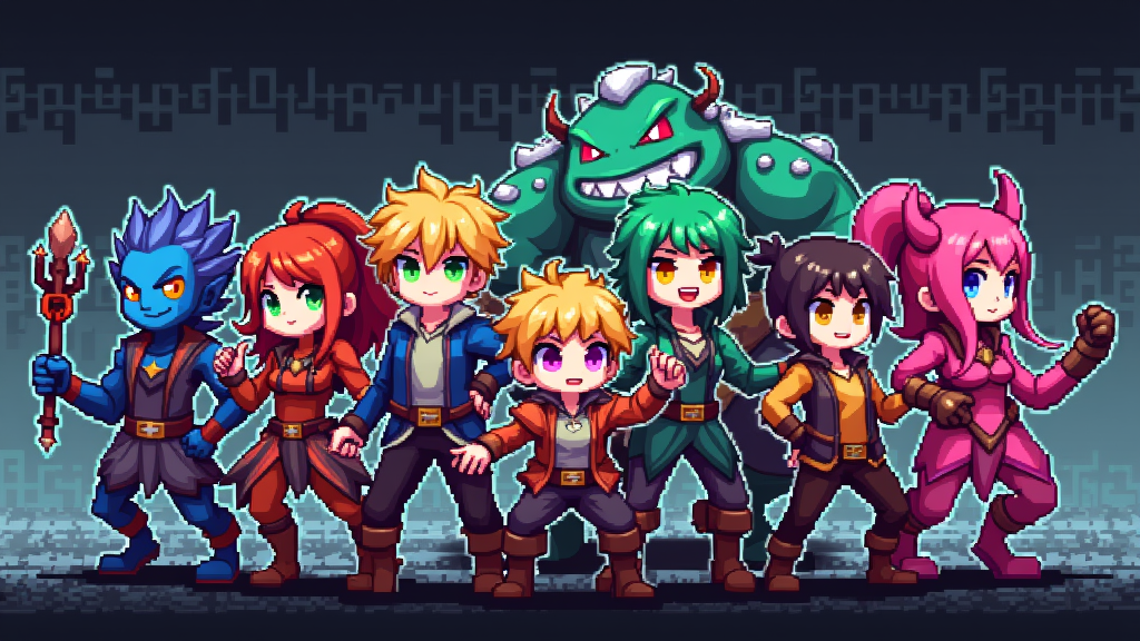
Pixel art character design is both a creative challenge and a super fun adventure. Creating tiny, detailed characters that stand out while working with such a limited space is a skill that gets better with practice and know-how. Whether you’re looking to make sprites for games or just want to spice up your art skills, starting with the basics really helps. Here, I’ll walk you through key tips and ideas that make designing pixel art characters a whole lot easier and more enjoyable.
Getting Started with Pixel Art Characters
Pixel art began as a necessity in classic video games due to strict hardware limits, but now, it’s a timeless style people love for its nostalgia and adaptability. Designing characters in pixel art boils down to careful planning, thoughtful simplification, and clever use of space. Every pixel on the canvas matters, so making each one count is super important.
The process usually starts with a simple sketch or idea, which is then gradually refined as you zoom in and decide where each color spot will go. Most designers find it useful to focus on strong shapes, clear silhouettes, and a limited palette to make each character pop.
Today, pixel art pops up in everything from indie games to social media avatars. Tools like Aseprite, Piskel, and even Photoshop or Procreate with a low-res canvas are pretty handy for anyone getting started. These tools make it easy to get a feel for the pixel workflow and experiment with your own characters, so don’t be afraid to try a few and see which feels best to work with.
Core Concepts in Pixel Art Character Design
Learning the fundamentals of pixel art is the best way to set a solid foundation. Here are a few terms and concepts worth getting familiar with early on:
- Canvas Size: This refers to the number of pixels your character will use. Smaller sizes make for simpler art, while slightly larger sprites offer more room for detail but take longer.
- Palette: Picking a small set of colors, usually between 8 and 32, helps keep your character clean and readable. Limited palettes give unity and make the character instantly recognizable, no matter the size.
- Silhouette: The outline of your character should be easy to spot, even in shadow. A strong silhouette helps players or viewers know what your character is at a quick glance.
- Anti-aliasing: This is a technique for reducing harsh edges by adding intermediate shades, but it’s best kept subtle or skipped on very tiny sprites to avoid clutter.
Step-by-Step Guide to Pixel Art Character Design
I find having a process really makes things less overwhelming. Here’s a guide that breaks down the main steps:
- Decide on the Character’s Purpose: Are you making a game hero, a background shopkeeper, or a fun social avatar? Knowing this helps shape every decision.
- Sketch a Simple Outline: I usually start by blocking out the pose and main body parts with a single color. It’s all about getting the proportions and general feel right.
- Focus on the Silhouette: Before getting into details, I zoom out to check if the character’s outline is clear and unique compared to others.
- Lay in Flat Colors: Once the shape looks good, I fill sections (like hair, clothes, and skin) with their base colors using the chosen palette.
- Add Simple Details: Now’s the time for smaller stuff, like belts, eyes, or accessories. I keep it minimal since too many details at a small scale get muddy really fast.
- Shade the Sprite: Adding shadows and highlights gives depth, but I keep my shading style consistent, using either simple (one shade), or more complex (two or three shades) styles depending on the sprite size.
- Clean Up and Polish: I make a final pass to tweak any questionable pixels and make sure the character looks solid from a distance.
Here is a 10-minute video about character design made by Saultoons!:
This process keeps you on track and helps you finish with a character you’re happy to share.
Practical Things To Keep in Mind Before Starting a Character
Just like any new art form, pixel art character design has its own learning curve. Before jumping in, here are some things I keep on my radar:
- Know Your Target Resolution: Decide if your character needs to fit a 16×16, 32×32, or even larger grid. Each size comes with its own challenges; smaller sprites need bigger features and simpler shapes, while bigger ones allow for more personality.
- Watch Your Palette: Fewer colors tend to look cleaner and are easier to manage. If I find myself struggling with color choices, I check out popular color palettes online for a good starting point.
- Plan Animation Early: If you want your character to walk, jump, or attack, think about how the pose and design will work in motion. Simple, readable designs usually animate more smoothly and look better.
- Reference Real Life and Other Art: Collecting references helps avoid common design hiccups. I often check out classic video game sprites or even photos to solve tricky pose or clothing questions.
Canvas Size and Shape
Choosing your canvas size is one of the first decisions to make. Classic games often use 16×16 or 32×32 sizes, but you can go larger if you want more detail. The smaller you go, the more every pixel matters; slight changes can totally change your character’s look.
Palette Selection
Picking colors is honestly one of my favorite parts, though it can take some experimenting. Limited palettes are easier to manage, but don’t be afraid to try out palettes from sites like Lospec or gather inspiration from your favorite games. Swapping colors around and testing a design in different combinations can really open your eyes to what works best for your project.
Silhouette and Readability
A strong silhouette is what makes a character memorable. I often check the sprite against a black background or color it all one tone just to see if the outline stands out. This is especially handy for game sprites where the character moves against different backgrounds. Silhouette checking is a classic trick used by pros to make sure that no matter the background or color scheme, your character always pops off the screen.
Plan for Animation
Even if animation isn’t in your immediate plans, simple poses with clear, spread-out limbs work best. I keep the arms and legs visible if I know they need to move. A solid idle pose is a good foundation for almost any action you might want to add later. Think about how your character will move; more readable shapes generally mean smoother, better-looking animations down the line.
💡Advanced Tips and Tricks for Pixel Art Character Designers
Once you’re comfortable with the basics, there are a few extra techniques I like for making pixel characters stand out:
Use Color Clustering: Grouping similar colors together in blocks instead of scattering pixels makes your art tidier and gives it a smooth style.
Try Selective Outlining: Using darker lines only where you need them (like between legs or under a chin) helps shapes pop without boxing your character in.
Push Contrast: Stronger contrasts in shading and color help sprites read well, especially on tiny canvases. Subtle shifts can get lost, so don’t be afraid to crank up the difference between shadows and highlights.
Be Intentional With Detail: If I want a small feature (like an earring or badge) to stand out, I make sure it uses a unique color or is placed deliberately so it doesn’t get lost. Picking details to spotlight is part of the fun at this scale.
Iterate and Compare: I’ll often draw multiple versions side by side, making tweaks until I’m happy. Comparing poses, different hairstyles, or even minor color choices can help you pick the most readable and appealing option for your sprite.
How Equipment Can Change Your Workflow
The tools you use can definitely affect how smooth your pixel art process feels. Several modern programs are built just for pixel art. Aseprite, Piskel, and Pixie Engine are all worth tracking down. Most of these tools give you features like onion skinning, organized color palette management, and simple exporting options (like sprite sheets for game design).
If you don’t have advanced software, you can make it work with a low-res grid in standard art programs or even free mobile apps. It’s more about your comfort and workflow than the tool itself!
- Game Development: Developers often use pixel art characters for in-game assets like NPCs, heroes, and enemies. Keeping file sizes low and animations smooth is key in these setups.
- Avatars and Icons: Pixel art is trending for social profiles or Twitch avatars because it looks bold and unique at small sizes, instantly showing off personality.
- Fan Art and Illustration: Many artists try pixel art for fun interpretations or as a way to learn about color and design limits.
❓Frequently Asked Questions
Here are some common questions I see from folks just getting started with pixel art characters:
Question: What is the easiest canvas size for a beginner?
Answer: 32×32 is usually a sweet spot. There’s enough space for some detail without it feeling overwhelming, and you learn a lot about simplifying shapes at this size.
Question: How do I fix stiff-looking characters?
Answer: Try using more dynamic poses right from the start. Even just tilting the shoulders or moving one foot forward can make your character look more lively and less rigid.
Question: How many colors should I use?
Answer: You don’t need many. A lot of fantastic sprites use only 8-16 colors. Try it and see what feels easiest to manage; limiting your palette actually unifies your design and looks great across multiple backgrounds.
Wrapping Up
Pixel art character design is inviting and friendly to beginners, but there’s a lot of creativity and technique behind making great tiny designs. Keeping the right canvas size, using a small yet smart color palette, and making your silhouette bold and clear really does make a massive difference. The learning experience is super rewarding, and the more you experiment, the more you’ll stumble upon your own unique style. If you want to check out a range of pixel art or test some software, websites like Lospec show off tons of galleries, color palettes, and resources that are worth tracking down. Keep at it, and you’ll see steady growth in both your designs and confidence!
