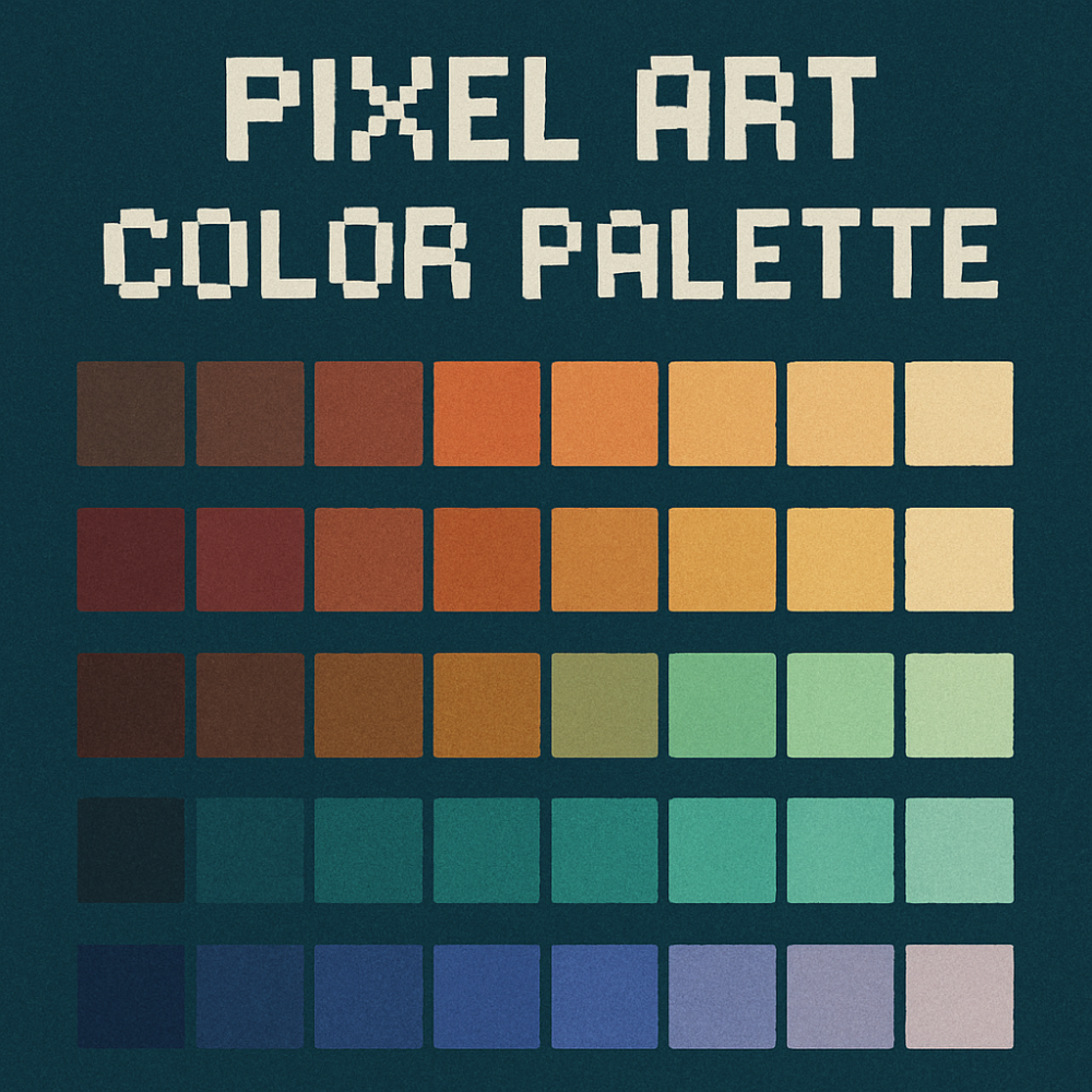
Why Choosing Your Color Palette Matters in Pixel Art

In pixel art, every pixel counts, and so does every color. You don’t have a ton of space to work with, so your colors need to pull their weight. A good palette sets the mood, brings your characters and scenes to life, and keeps things clean and easy to read. When you’re limited to just a handful of hues, choosing the right ones can completely change how your art feels and can give it a consistent aesthetic in whatever project you are making, in other words, Your Own Style.
Colors aren’t just for making things look pretty, they tell stories. Back in the early days of gaming, artists had to work with super limited palettes. Think about the old-school games we grew up with. They only had a few colors to work with, but they still managed to create these immersive, unforgettable worlds. That’s the power of a well-picked palette.
Those early games didn’t just use color for looks. They used it to spark emotion and set the tone, something we still see in modern pixel art. Dark, moody palettes can feel eerie or intense, while bright, saturated colors make things feel fun and playful. These choices make each game stand out in its own way and leave a lasting impression.
Colors also carry different meanings depending on who’s looking at them. Cultural context plays a big role. A bold red might mean danger to one player and love or passion to another. When you understand these nuances, you can use color to connect with players in deeper, more meaningful ways without ever saying a word.
Bottom line: color isn’t just a visual element, it’s emotional, functional, and foundational. A good palette enhances storytelling, shapes the player’s experience, and helps your art hit harder.
The Science Behind Picking the Right Palette
Picking colors isn’t just about what looks cool, it’s also about how colors interact. That’s where color theory comes in. It’s the science behind contrast, harmony, and balance.
Your palette affects how players experience your game. The right combination of colors helps guide their focus, keeps visuals easy to read, and avoids eye strain. Harsh contrasts or overly bright hues can be uncomfortable, especially during long play sessions.
Balance is key. That doesn’t mean everything has to match, but your colors should work together. A strong contrast helps important elements pop, while subtle shifts in tone can add texture and depth. Playing around with shades from the same color family or complementary colors can make a scene feel more dynamic without overwhelming it.
There’s also the technical side. Back in the day, palettes had to be small because of RAM and storage limits. Even now, understanding how colors are stored and displayed (especially across different screens and formats) is still super important. A color that looks great on your monitor might not translate the same on someone else’s.
So yeah, thinking scientifically about your palette means you’re not just making art that looks good, but also works well technically.
Tips for Making Smart Palette Choices
If you want your pixel art to really resonate, you’ve gotta be intentional with your palette. Start by thinking about the vibe or emotion you’re going for. Want something eerie and mysterious? Or lighthearted and playful? Let that guide your color choices.
Today’s tools make testing palettes a breeze. There are tons of apps and online tools that let you preview different combinations before committing. Use them to check for readability, contrast, and how the palette plays out in your scene.
Learning from experienced artists is a game-changer, too. Common rookie mistakes include using too many colors or sticking with a palette that doesn’t match your vision. Getting feedback or studying how pros build their palettes can help you dodge these traps.
Look at successful games for inspiration. Break down how they use color. Notice the way they highlight characters, add depth, or create atmosphere using just a few shades. There’s a lot you can learn from what’s worked before.
At the end of the day, your palette is one of your strongest tools. Use it wisely, and your pixel art will not only look great, it’ll feel alive.
❓Final Thoughts
At the end of the day, color is one of those things that can make or break your pixel art. It’s not just about making stuff look pretty, it’s about how it feels, how it reads, and how it connects with people. A solid palette can turn something simple into something that really sticks with you.
Don’t stress too much about getting it perfect every time, as you make pixel art you’ll notice that sometimes it’s best to just keep it simple and not overcomplicate things. Mess around, trust your gut, learn from what other artists are doing by watching some tutorials online, and keep experimenting. You’ll start to notice what works for you.
Honestly, the more you play with color, the more fun it gets. And when you land on a palette that just clicks, you’ll feel it. That’s the magic.
So yeah… have fun with it. Your colors are your voice; use them to say something cool.
What do you think about the importance of color palettes?… What’s your favorite color to work with?… Let me know down in the comment section below! 🙂